

Be bold. Be Brave. Be brilliant.
Your brand logo is possibly the most important visual tactic you will ever possess. It is the simplest yet most hard-working manifestation of you and your brand. It will become a visual signifier for all you represent and stand for, the embodiment of your brand and the symbol around which you rally.
↓ Logos ↓
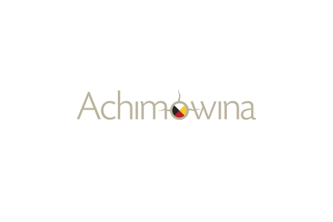
Nisichawayasihk Cree Nation is a culturally rich First Nations community and Achimowina is the publication acting as the nation’s voice. The Cree name Achimowina means ‘stories’ and reflects deep connections with their traditions, beliefs, lands, and people. While Nisichawayasihk means ‘where three rivers meet’ and is symbolized in the wordmark in combination with the all important medicine wheel.

Australian born artist Adam Rasmussen specializes in stainless steel sculptures. His work pays homage to his love of sharks and the sea. These thoughts are combined to create the letterform of a cap ‘A’ forming the illusion of a shark fin cruising through the sea. It’s smooth and polished, representative of his work and medium of choice.
Aurora Sustainable Buildings Group provides knowledge, tools and access to recognized leaders in all aspects of the sustainable building field; ensuring the viability of construction design and development, while reducing environmental impact. A building silhouette hovers over the horizon alluding to the flickering northern lights and creating immediate recognition of the company’s business focus to build a better future.
A ‘light’ approach was taken for a hypnotherapist using both the spark of a flame and a classic hypnotic swirl pattern to make up the lowercase ‘i’ in this word mark. The spark represents igniting a change in behaviour while the swirl represents the meditative state of consciousness.
Children’s Rehabilitation Foundation is dedicated to helping children with disabilities and special needs be as independent as possible. Through special events, grants and donations they raise funds for specialized equipment and programs. The happy child swinging in the ‘C’, represents a caring support system and goal: help kids be kids. A series of illustrated kids being kids help in other marketing efforts to support the main character.
This group of marine contractors specializes in underwater construction, maintenance and repairs, salvage, inspections and underwater surveying. Two upper case letter D’s create a feel of strength and confidence, while the white swoosh plays off of the ‘Diver Down’ symbol and doubles as a divers’ all important lifeline, airline or hookah. Then a few bubbles were incorporated to enhance the sense of a deep dive.
EnerPure’s waste oil regeneration technology provides a profitable and sustainable solution for recycling waste lubricating oil. A fresh simple wordmark with an oil drop icon carried the green message with a highlight in the shape of a leaf to help support their motto of refuelling a cleaner future.
The Excelus Financial logo uses a stylized butterfly, a deep and powerful representation of life. The butterfly in the wordmark replaces the ‘x’ and represents positive transormation. It is also placed in an atypical position, rising above the other letterforms. Around the world, people view the butterfly as representing endurance, change, hope, and life. This manifestation is a symbol of their customers, and their ability to help change lives by establishing stronger credit profiles, a lifeline to fulfilling future dreams.
Rooted in faith, the Genesis mission is to create art that inspires change and brings hope to community by creating dance that is accessible to all audiences. A flowing script creates a sense of motion and rhythm beginning with the cap ‘G’ forming the gestural move of a dancer reaching for the stars.
Into the Blue is no ordinary fish-store. Their passion for education and sustainability of aquaculture was at the heart of their identity. Letter forms were specifically designed to morph from barren structures to living organic shapes representing water, fish, invertebrates, and corals, evoking the energy and life inherent in a healthy reef.
Intouch Kiosk specializes in interactive software and creative content development for touchscreen kiosks. Their work in the self-service marketplace includes product information, museum, exhibition, wayfinding, contests and games for clients like Ikea, General Motors, Mattel and Ripley’s. The logotype mimics a finger touching the screen and the explosion of engagement that happens thereafter.
A family run business working in the heart of Canada’s Lake of the Woods, this architectural group creates vacation homes, cottages, boathouses, bridges, and more. Their aim is to enhance the beauty found by carefully adding man made structures, with the least amount of disturbance to nature’s qualities. Simple water colour strokes simulate a cottage by the water, harmoniously combining the natural environment and the human element into a beautiful union.


The Leader in Me is FranklinCovey’s whole school transformation process. It teaches 21st century leadership and life skills to students and creates a culture of student empowerment based on the idea that every child can be a leader. The word mark made its start in primary schools where its simple bold colours connected to teachers and students alike and now garners accolades as a leader in education worldwide.
The Mature Women’s Centre meets the health needs of women as they move through the menopause transition. This logo reinforces the nurse-managed model of care which emphasizes health promotion and disease and disability prevention from a physical, cultural, emotional, and spiritual perspective.
Sam Bracken battled homelessness, poverty, and abuse to successfully earn a full-ride football scholarship to the Georgia Institute of Technology. In My Orange Duffel Bag, he shares his personal story of overcoming the odds and radically changing his life so others can create positive, lasting change of their own. A book, website, and foundation have all been created in hopes of guiding others on their own paths to radical change.
The Never Alone Foundation is a charity committed to improving the lives of people affected by cancer by supporting a multitude of agencies, projects and programs. Two hands rise up to form a heart and an awareness ribbon, to strengthen the idea of never being alone in the fight and that together, so much more can be accomplished.
Norima Consulting specializes in I.T. solutions for some pretty headsy industries including insurance, utility & energy, healthcare and financial services. Their mix of ingenuity and sensibility was a refreshing approach from the industry norm. A brain that doubles as a maze supported their problem solving mission and an ‘uncommon sense’ every smart business wants on their side.
PiQ offers a wide range of products for students, educators and families; all of which work to instil planning skills while focusing on key areas in student development such as character and performance, personal discovery and aspiration, studying and testing, employability and post-secondary opportunities; and environmental and social responsibility. This custom type treatment creates a look that is proprietary, energetic, simple, fun, and unique to the market. The ‘P’ and the ‘Q’ are identical, with the ‘Q’ being flipped on its side to represent movement forward. The ‘i’ is the centre, and as it should be, represents our beloved students; the reason we all do this in the first place. This is our mark for kids, teachers & schools.

Prosapien provides tailored compliance and health and safety software for large organizations operating in high risk sectors. Prosapien means pro-human or people first. The square in the letter ‘o’ represents data that transforms into the dot of the ‘i’ representing a person. This transformation speaks to making complex software systems management simple or ‘compliance simplexity’.
Regulators Dive Club already had a funky name and was looking for something a bit different for their club courses and events. This fun pirate motif was fasioned with the diver’s head and mask as a skull and crossbones made from the tanks and fins, while the letter ‘O’ acts as the regulator. Of course it looks great on classic pirate black but the mark was made to go on any colour making it flexible for different dive trips & events year to year.

StarMaker Orthodontics clinic in Beverly Hills specializes in confidence building treatment for pre-teens, teens, and young adolescents. The logo depicts a graphic smile with braces, but also shows a progression of personal stardom, gaining momentum and brightness; symbolizing how important your smile is to your own personal goals.
Studio 11 is an award winning recording studio and artist development facility. The word mark emulates a volume dial symbolizing “turning it up to eleven” idiom from the movie ‘This Is Spinal Tap’, where an amp’s volume knob is marked from zero to eleven, instead of the usual zero to ten, symbolizing taking something to the extreme.


Pitlbado Law used simple and approachable ingredients for their law-firm brand and corporate logotype. The same recipe was adapted to create a family of program specific logos including the Pit-U Learning Centre, A.M.P. Associate Marketing Program, the BizStart New business program, LOL Law on-line consumer products, and Raising the Bar for community initiatives.
Tukto Lodge is a premier fishing destination located in Canada’s northern provinces of Northwest Territories and Nunavut; known to anglers for arctic grayling and some of the largest lake trout in the world. Tukto is Inuit for caribou; who’s silhouette can be seen in this logo’s letter ’O’ which represents the arctic region’s “land of the midnight sun”.
Unite is a concept for a skateboard company.
Wings Over Kississing provides air charter solutions for business and wilderness travel in the heart of the Canada’s north. The logo’s motif represents a northern landscape while doubling as a great eagle or Thunderbird; the supreme nature spirit serving Mother Earth. The new logo and livery pays homage to the land and its people.

This Wellness Works logo is for a leading Canadian provider of financial products and services to credit unions across Canada. They take pride in providing wellness programs to help foster employees who are healthy and happy. The icon uses an apple combined with a yin and yang symbol to reinforce a healthy and well-balanced approach to the workplace.
